The Visual Identity
of Calm Productivity.
A guide to the aesthetics, voice, and visual principles of Planify. Designed for builders who value clarity over complexity.
Philosophy
The core values that drive our visual decisions.
Operational minimalism. We believe that tools should recede into the background, allowing the work itself to take center stage.
Stone-Toned Clarity
Our interface uses warm stone neutrals to reduce eye strain and provide a calm canvas for project data. We avoid aggressive blues and high-contrast shadows.
Intentional Action
Every pixel must serve a purpose. If a UI element doesn't help a solo founder move a project forward, it doesn't belong in our design system.
About
Standard descriptions for media and partners.
The Mission
Planify is built for the new era of independent work. We provide a lightweight operating system that handles the overhead of project management, client relations, and financial tracking, so solo founders can focus on building.
Boilerplate (Short)
Identity
Our logo is the anchor of our brand.
Primary Icon
Inverse Icon
Usage Notes
- Maintain a clear safety zone of at least 20% of the icon's width.
- Do not distort, rotate, or apply gradients to the icon.
- Use the inverse icon only on dark backgrounds (Stone 800 or darker).
Visuals
Colors and Typography.
Color Palette
Planify Orange
#E97B35
Stone 900
#1C1917
Stone 500
#78716C
Warm Stone
#F8F5F2
Typography
Headings / Space Grotesk
The quick brown fox jumps over the lazy dog.
Body / Inter
Planify uses Inter for all body text to ensure maximum readability and a clean, modern aesthetic.
Product
The operational reality of Planify.
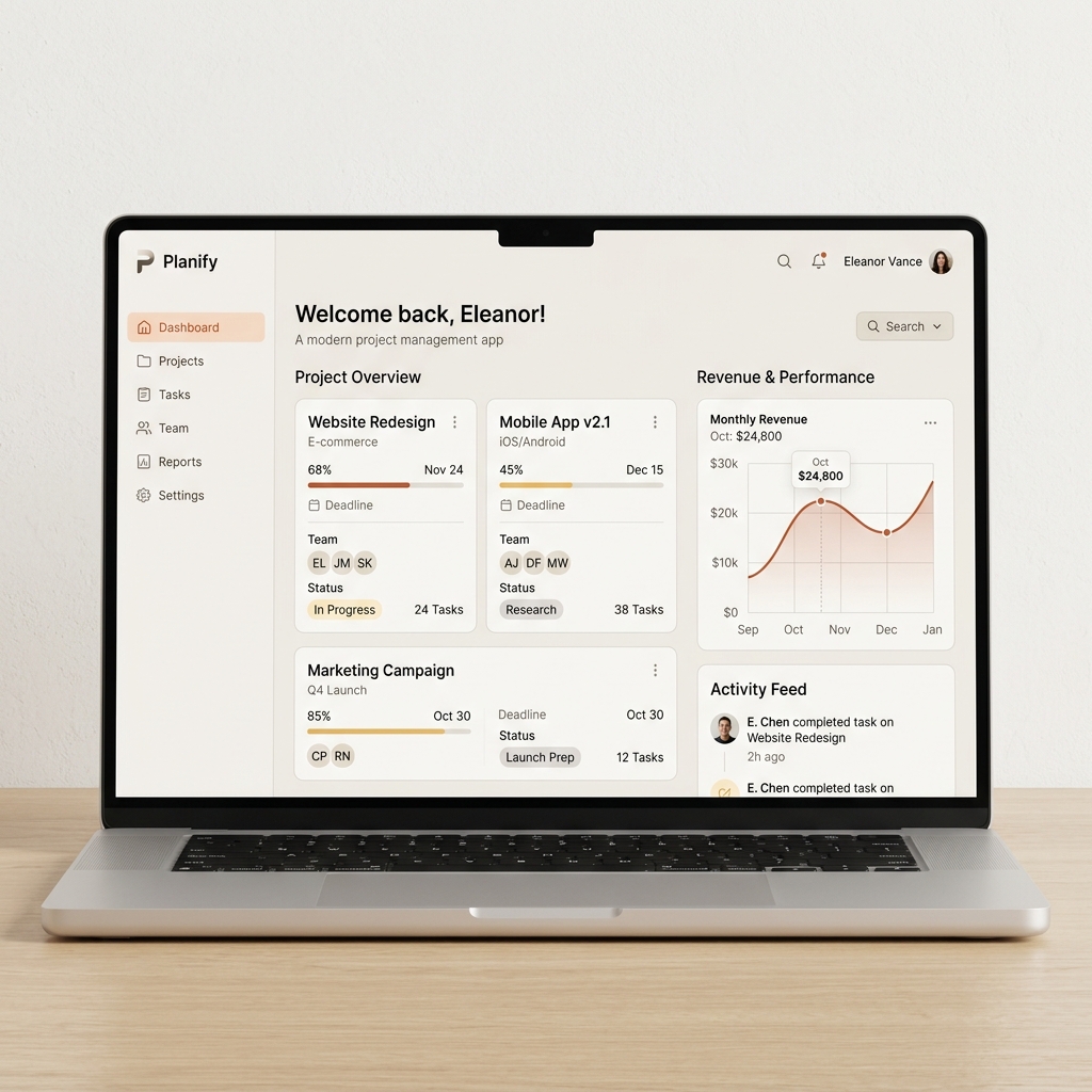
Command Center
The core dashboard provides a high-level overview of revenue, active projects, and upcoming deadlines without visual noise.
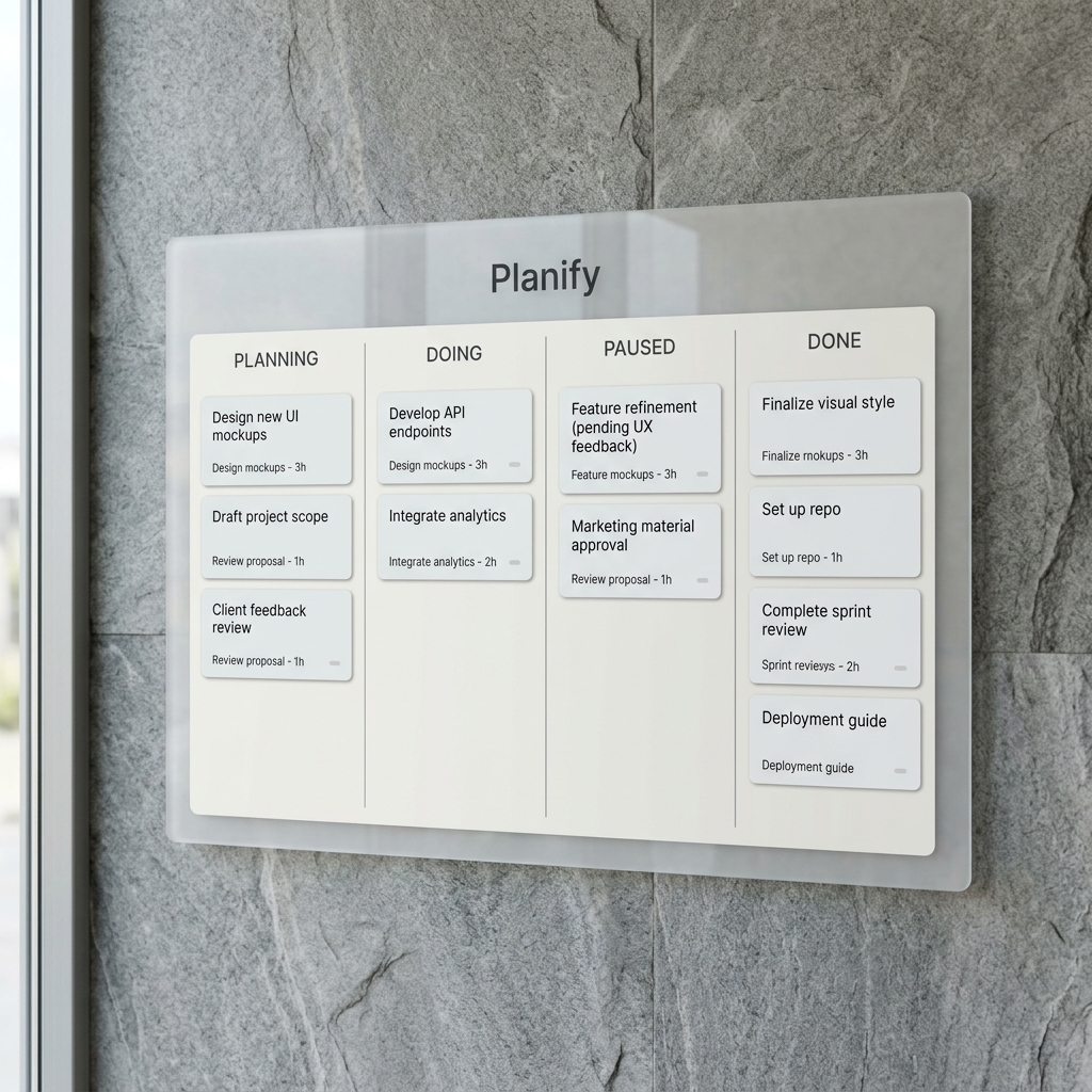
Siloed Workflows
A minimalist Kanban board that keeps every client siloed. No data bleed, just focus.
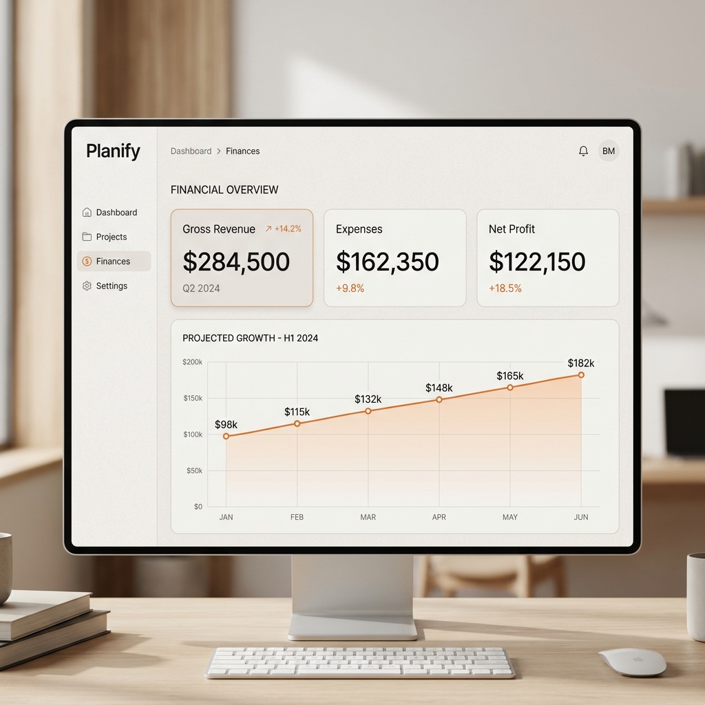
Financial Intelligence
Revenue tracking tied directly to task completion. Know exactly how much you've earned, instantly.
Voice
How we speak to our community.
Direct
We value clarity over cleverness. We use simple language to explain complex workflows. No fluff.
Calm
We don't use "startup hype." Our tone is steady, reliable, and supportive of the builder's focus.
Empathetic
We understand the challenges of solo work. Our voice reflects a deep respect for the individual creator.
Usage
Maintaining brand integrity.
Do
- ✓ Refer to us as "Planify" (capitalized).
- ✓ Use our stone-toned color palette for integrations.
- ✓ Link to
getplanify.app.
Don't
- × Refer to us as "Planify App" or "The Planify".
- × Alter the logo colors or aspect ratio.
- × Associate Planify with aggressive marketing tactics.
Downloads
Get everything in one package.
Complete Brand Kit
Includes SVG logos, icons, and product screenshots.